


Most business owners assume website accessibility is something only hospitals, universities, and Fortune 500 companies worry about. It isn't. If your site has images, forms, buttons, or video, it already has accessibility built into it, well or badly. The good news is that the fixes that matter most are not technical projects. They are small editorial and design decisions you can make yourself, and this website accessibility checklist walks through twelve of them.
Key Takeaways
Website accessibility means your regular site works for people using different devices, screen sizes, and input methods. It isn't a separate "special version."
Most problems on small business websites come from content choices, not code: missing alt text, vague link labels, unlabeled form fields, low-contrast type.
Accessible sites are easier for everyone, which usually shows up as more completed forms and fewer support emails.
You can check a lot yourself with a keyboard, a contrast checker, and a free automated scan.
Automated tools catch only part of what's wrong, so manual testing is worth more than any single scan.
Accessibility is easiest to maintain when your builder handles headings, alt text, forms, and mobile layout properly from the start.
What Is Website Accessibility?
Website accessibility means building and writing your site so people can use it regardless of how they interact with a screen. That includes people who are blind or have low vision, people who are deaf or hard of hearing, people with limited mobility who navigate by keyboard instead of a mouse, and people with cognitive or reading differences who need clear structure and plain wording.
It also includes a much larger group nobody thinks of as "accessibility users." Someone reading your pricing page in bright sunlight. Someone with a cracked phone screen. Someone watching your explainer video on mute in a waiting room. A customer in their seventies whose eyesight isn't what it was.
The important idea is that there is no separate accessible website. There is one site, and it either works for these visitors or it doesn't. Standards like the Web Content Accessibility Guidelines (WCAG) describe what "works" means in practical terms, and US regulations reference them. But you don't need the specification to make real progress. Business website accessibility mostly comes down to habits: describe your images, label your fields, keep your text readable, and make sure everything can be reached without a mouse.
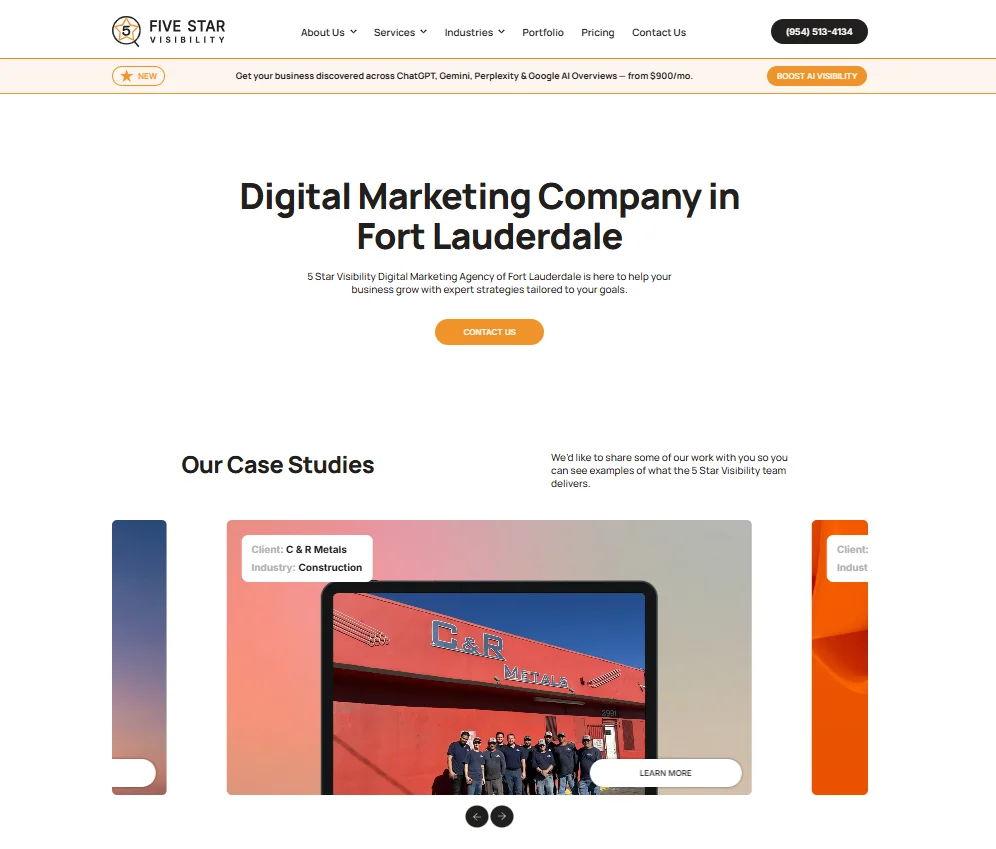
A single large heading names the service and the city. The navigation says where each link goes, and the phone number is real text rather than an image. The case study card labels its information in words — "Client:", "Industry:" — instead of leaving the meaning to be inferred from position. The carousel controls are large circles with space around them, comfortably in fingertip range on a phone.
5 Star Visibility, 5starvisibility.com
Why Website Accessibility Matters for Business Websites
The most direct reason is that inaccessible pages quietly lose you business. A visitor who can't tell which form field is which, or can't read your call-to-action button against its background, doesn't file a complaint. They leave, and you never learn why. Accessibility fixes tend to pay for themselves because they remove the same friction that makes ordinary visitors give up.
Here is what improves when you make a business website accessible:
Forms get completed more often: Clear labels, visible errors, and plain instructions reduce abandonment for everyone.
Mobile users have an easier time: Bigger tap targets, readable type, and simple navigation help the majority of your traffic.
Your content becomes easier to scan: Proper headings help readers skim and help assistive technology announce structure.
Trust goes up: A site that behaves predictably signals a business that pays attention to details.
Fewer support requests: When instructions are understandable, people ask fewer basic questions before they buy.
Your reach widens: Roughly one in four American adults reports some form of disability, a meaningful share of any local market.
There is a legal dimension as well, and it deserves a measured mention. In the United States, businesses have faced claims under the Americans with Disabilities Act over websites that were difficult or impossible for disabled customers to use. What counts as compliance in a given situation is a question for a qualified attorney, not a blog post or a software vendor. What this article can tell you is that the fixes below address the problems that come up most often, and that doing them well is good practice either way.
Website Accessibility Checklist: 12 Fixes to Start With
You don't have to do all twelve at once. Work through them in order, or start with whichever pages carry the most revenue. Each can be done by whoever already edits your site, without touching code.
1. Add Helpful Alt Text to Images
Alt text is a short written description of an image, read aloud by screen readers and shown when an image fails to load. Write it as if you were describing the picture over the phone: "Technician repairing a rooftop HVAC unit" beats "IMG_4471." Photos that carry meaning need alt text. Decorative flourishes and divider graphics don't, and should be marked as decorative so screen readers skip them. If an image contains text, such as a promotional banner, repeat that text in the description.
2. Use Clear Page Headings
Headings are structure, not decoration. Each page should have one H1 that states what the page is about, with H2s for major sections and H3s for subsections inside them. Screen reader users often navigate by jumping heading to heading, the way a sighted reader skims, so a logical order matters. The common mistake is choosing a heading level for its size, then ending up with an H4 above an H2. If a heading looks wrong, change the styling, not the level.
3. Check Text Contrast
Low contrast is the single most common accessibility failure on business websites, and it usually arrives with good intentions: light gray body copy on white, white text over a photo, brand-colored buttons that look elegant on a designer's monitor. The general benchmark is a contrast ratio of at least 4.5 to 1 for normal text. You don't have to calculate anything: paste your two colors into a free contrast checker and it will tell you pass or fail. Then view your site outdoors on a phone, a surprisingly reliable second opinion.
4. Make Navigation Work With a Keyboard
Plenty of people never touch a mouse, whether because of a motor condition, a temporary injury, or preference. Test this in two minutes: open your homepage, put the mouse aside, and press Tab repeatedly. You should reach every menu item, link, and button in an order that matches how the page reads, and Enter should activate what you land on. Watch for anything that traps you, and for menus that only open on hover.
5. Keep Focus States Visible
As you tab through a page, the element you are currently on should be obvious, usually as an outline or highlight around it. That indicator is called the focus state, and it is frequently removed because someone thought the outline looked untidy. Without it, keyboard users are navigating blind. If you press Tab and can't tell where you are, that needs fixing. You don't have to keep the browser default, but the replacement must be clearly visible.
6. Write Descriptive Links and Buttons
"Click here" and "read more" tell a visitor nothing until they read the surrounding sentence, and screen reader users often pull up a list of links in isolation, where a page of identical "read more" entries is useless. Write links that describe their destination: "See our pricing plans," "Download the maintenance checklist." The same applies to buttons. "Submit" is vague; "Request a quote" tells people what will happen, and specific labels reduce hesitation.
7. Label Every Form Field
Every input needs a label that stays visible. The popular pattern of putting the label inside the field as placeholder text looks clean and fails badly: the moment someone types, the hint disappears, and anyone distracted mid-form has no way to know what the field wanted. Keep labels above or beside fields, mark required fields clearly, and if a field needs a particular format, say so next to it rather than only after someone gets it wrong.
8. Make Form Errors Easy to Understand
When a submission fails, three things should happen. The visitor should be told an error occurred, in text rather than color alone. The specific field at fault should be identified and easy to find. And the message should say how to fix it. "Invalid entry" is a dead end; "Please enter a phone number with 10 digits" is a fix. Never rely on a red border alone, since someone with color blindness gets nothing from it. And keep whatever the person already typed so they aren't forced to start over.
9. Add Captions to Videos
If you use video anywhere on your site, from a homepage explainer to a testimonial, it needs captions. This helps deaf and hard-of-hearing visitors, and also the large share of people who watch with the sound off in public or in an open office. Auto-generated captions are a starting point but usually mangle names, product terms, and prices, so review and correct them. For audio-only content, a transcript does the same job.
10. Make Tap Targets Easy to Use on Mobile
Accessibility and mobile usability overlap heavily. Buttons and links need enough size to hit accurately, roughly the area of a fingertip, and enough space between them that an imprecise tap doesn't trigger the wrong thing. Watch for crowded footer links, tiny social icons, and popup close buttons. Test on a real phone, not a resized browser window.
11. Use Plain Language for Important Instructions
Clear writing is an accessibility feature, particularly for people with cognitive disabilities, readers with limited English, and anyone in a hurry. It matters most anywhere you ask someone to act: form instructions, checkout steps, appointment booking, and calls to action. Use short sentences and one instruction per line. Say "We'll call you within one business day" instead of "A representative will initiate contact within the standard response window."
12. Test the Site With Simple Tools
You need four checks, none of which require a developer. First, the keyboard test above: tab through your key pages and confirm everything is reachable and visible. Second, a contrast checker for your brand colors and any text sitting on images. Third, a free automated scan from a browser extension, run against your most important pages rather than the whole site.
Fourth, listen to a page. Screen readers are already installed on most computers and phones, and ten minutes with one on your homepage teaches you more than any report. It will be disorienting at first. That's the point: you hear your site the way some of your visitors experience it, and the problems become obvious.
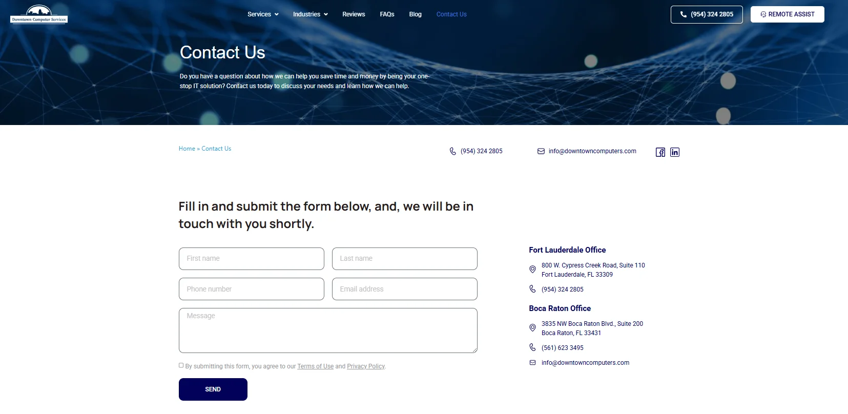
Each field keeps its name on screen. The label starts inside the box and moves up as you type, so the form still tells you what it wants after it's filled in. The consent line names what you're agreeing to and links to "Terms of Use" and "Privacy Policy" by name. Phone, email, and both office addresses sit alongside as live links, so nobody is forced through the form to reach the company.
Downtown Computer Services, downtowncomputers.com/contact-us
Common Website Accessibility Mistakes
Most sites fail in the same handful of places, largely because these mistakes are invisible to whoever built the page. Scanning for them is a fast way to find real issues.
Missing or unhelpful alt text: Filenames left in place of a description get announced literally, which tells the listener nothing.
Buttons and icons with no accessible name: A cart or search icon with no label is announced simply as "button."
Low-contrast text: Light gray body copy, placeholder text, and captions over photos are the usual offenders.
Form fields labeled only by placeholder text: The hint vanishes the moment someone starts typing.
Vague link text: "Read more" repeated dozens of times across a page gives no one anything to go on.
Hover-only navigation: Menus that open on hover can't be reached by keyboard or touch users.
Color used as the only signal: Errors or required fields marked in red alone are invisible to some visitors.
Video without captions: Autoplaying homepage videos are the most common offender here.
Skipped heading levels: Headings chosen for their size rather than their place in the structure.
PDFs used in place of a web page: Especially when the PDF is a scan with no selectable text.
None of these require a rebuild. Almost all can be fixed by the person who normally updates your content, in an afternoon of focused work.
How to Check Website Accessibility Without Being a Developer
Start by narrowing the scope. You don't need to audit every page. Pick your homepage, your main service or product page, your contact or quote form, and checkout if you have one. Those pages carry most of your traffic and nearly all of your conversions.
Then work through a consistent sequence on each one:
Run an automated scan: A free browser extension or online checker will list detectable issues such as missing alt text, contrast failures, and unlabeled fields.
Do the keyboard test: Tab through the page and confirm you can reach and activate everything, in a sensible order, with a visible focus indicator at every stop.
Check contrast manually: Look at anything the scan couldn't evaluate, such as text sitting on top of a photo or video.
Read the page as a stranger: Are headings in a logical order? Do links make sense out of context? Would someone follow the instructions on the first try?
Submit the form badly on purpose: Leave a required field blank, enter a malformed email address, and see whether the errors are findable and clear.
Open the page on a phone: Check tap target size, spacing, text size, and whether anything requires pinch-zooming to read.
Be realistic about the automated part. Testing consistently finds that these tools detect only a minority of accessibility issues, because the rest require judgment. A tool can confirm alt text exists; it can't tell you the alt text is wrong. It can flag a missing label; it can't tell you the label is confusing. Manual checking is where the meaningful problems surface.
This is also why accessibility overlays and one-click widgets deserve caution. They can add useful features like text resizing, but they don't repair the underlying content, and disability advocacy groups have been consistently critical of products marketed as complete solutions. Treat any tool as an assist, not a substitute for fixing the page. And write down what you find and fix, so the work isn't redone later.
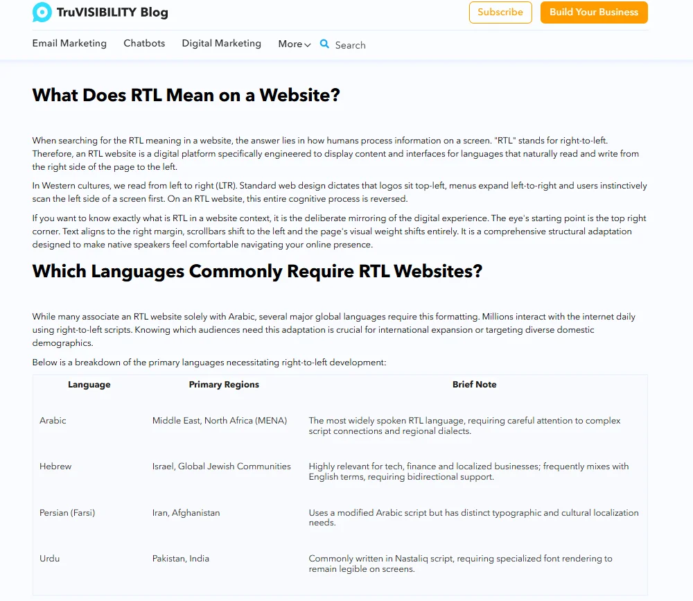
The page is built from named sections rather than a wall of text, so the article can be skimmed by heading to find the relevant part. That structure works the same way for screen reader users, who navigate by jumping heading to heading. The comparison table follows the same logic: its columns are named — Language, Primary Regions, Brief Note — so every cell has a header it belongs to, instead of leaving the reader to work out what each column means from the values in it.
TruVISIBILITY Blog, truvisibility.com/blog/what-is-an-rtl-website
What to Look for in an Accessibility-Friendly Website Builder
A lot of accessibility difficulty is inherited from the platform. If your builder makes it hard to do the right thing, the right thing won't get done consistently, especially when several people update the site.
The basics are these. Heading levels should be selectable independently of visual size, so you can keep a logical structure without sacrificing design. Alt text fields should appear in the image editor by default, not buried in an advanced panel. Form building should include real labels, required-field marking, and clear error messages. And you should be able to edit the mobile view directly, since tap targets and text size are where mobile accessibility is won or lost.
Templates matter more than people expect, because most sites keep whatever the template decided. Look for readable body text at a comfortable size, sufficient contrast in the default palette, and buttons large enough to tap. If a template's demo copy is light gray at 13 pixels, every page you build from it starts at a disadvantage.
This is one reason the TruVISIBILITY Sites app is built the way it is: heading structure, image alt text, mobile layout, and form fields are all editable without touching code, so the fixes in this checklist stay within reach of whoever manages your content. No platform makes a site accessible on its own, since most of the work is in the content. But a builder that puts these controls in front of you makes the difference between accessibility being routine and accessibility being a project you keep postponing.
Conclusion
An accessible website isn't a separate version kept somewhere for a small audience. It's just a well-built business website: readable text, sensible structure, forms that explain themselves, navigation that works however someone moves through a page. Every item in this website accessibility checklist improves the experience for visitors who have no disability at all, which is why the work so often shows up as better engagement.
Start with one page and a handful of fixes. Add alt text to your homepage images, tab through your contact form, check the contrast on your main button. Then make it a habit: whenever you publish a new page, spend five minutes on the same checks. Accessibility done that way is maintenance rather than a migration, and your site gets steadily better instead of accumulating problems you'll pay to fix later.
FAQ
Related articles


Want to receive more articles?
Sign-up for our weekly newsletter to receive info that will help your business grow