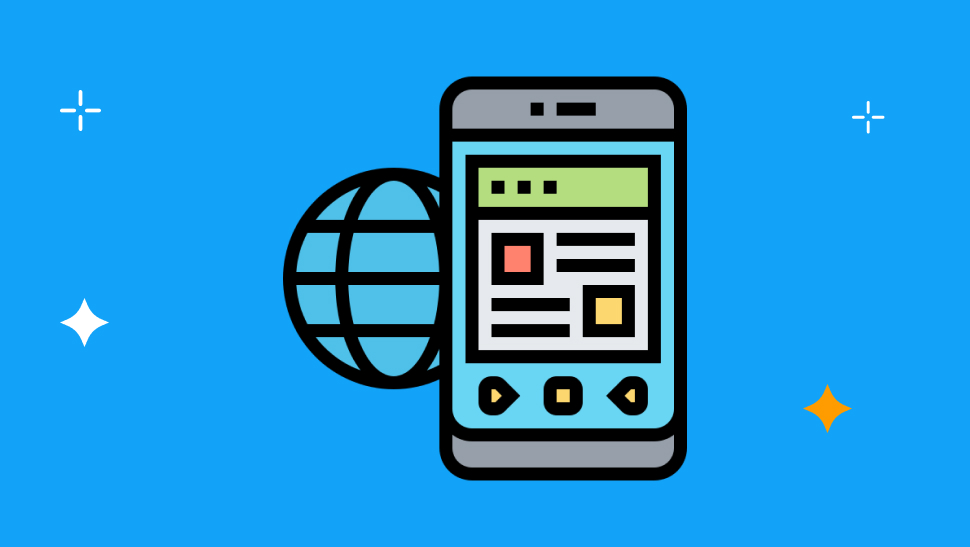
It is 2026. The smartphone is no longer a "second screen." It hasn't been for a long time. Yet, walk into almost any small business marketing meeting, and you will see the same scene play out. The team gathers around a large monitor to review the new company website. They check the layout, the menus, and the design details.
They are building a site for a user that barely exists anymore.
While they focus on the desktop experience, their actual customers - 70% to 80% of them - are trying to access that same site on a 6-inch screen while waiting for coffee, riding the bus, or walking down the street. And they are frustrated.
For too long, businesses have treated mobile design as a checkbox. They build for the desktop first, then rely on basic "responsive design" to simply squish and stack that same content into a single column for phones. In 2026, this approach is not just outdated; it is a critical failure. To succeed today, we have to stop shrinking desktop sites and start respecting the fact that the mobile web is a completely different world.
Why Your Desktop Site Doesn't Work on Mobile
The internet we built in the 90s and 2000s was defined by the desktop computer. It was a "sit-down" experience. Users had reliable power, fast wired connections, and most importantly, a mouse. The mouse allowed for incredible precision - you could click a tiny link, hover over a menu to reveal sub-options, and navigate complex pages easily.
The mobile web is totally different. It's not just a smaller version of the web; it follows different rules.
The Desktop Web is about:
- Precision: The mouse cursor hits tiny targets perfectly.
- Patience: Users are often sitting down to research or work.
- Complexity: Large screens allow for lots of info at once.
The Mobile Web is about:
- Speed: Users want answers now.
- Touch: Your finger is much less precise than a mouse.
- Distraction: Users are often moving, outside, or doing two things at once.
If you just show a mobile user a "shrunken" version of your complex desktop site, you are forcing them to use a tool that wasn't built for them. You are asking them to use a mouse-based interface with their thumbs.
Also, SSL Certificates Explained: Why Every Website Needs a "Padlock" in 2026
Designing for How People Actually Hold Phones
The most obvious difference is how we hold our devices. On a desktop, you can reach any corner of the screen instantly.
On a smartphone, 75% of users hold their phone in one hand and do everything with just their thumb. This creates a simple rule: if your thumb can't reach it, it doesn't exist.
- The Safe Zone: The bottom-third of the screen. This is prime real estate. Your menu, "Buy" buttons, and key links must live here.
- The Danger Zone: The top corners of the screen. It is physically painful or impossible for a user to reach these corners one-handed.
Traditional design puts the most important menu (the "Hamburger Menu") and the shopping cart in the top corners - the exact places mobile users cannot reach easily. If your mobile site forces a user to stretch their thumb or use two hands just to navigate, you have added friction. And on mobile, friction kills sales.
Also, remember that "hover" doesn't exist on phones. You cannot "mouse over" a menu to see what's inside. You have to tap. If your desktop site relies on hover effects to show important info, mobile users will never see it.
Mobile Users Want Answers Instantly
Beyond the physical differences, the mobile user is in a completely different mental state. Desktop users are often settling in for a session. They might browse, compare, and read long paragraphs.
Mobile users are in a rush. Google calls these "Micro-Moments." These are moments where a person turns to their phone to act immediately:
- I want to know: "Is your store open right now?"
- I want to go: "Directions to the nearest coffee shop."
- I want to do: "How to fix a leaky sink."
- I want to buy: "Order large pepperoni pizza."
When a user is in this mode, they have zero patience for long intros, huge banner images that push content down the screen, or confusing menus. They want the answer immediately.
If your mobile site is just a responsive version of your desktop site, it likely loads a massive image first. The user has to scroll past this just to find your phone number. In that split second of scrolling, they have likely already gone back to Google to find a competitor who gives them the answer instantly.
Why Mobile Speed is Critical for SEO in 2026
We cannot talk about mobile without talking about speed. In the desktop era, we had stable WiFi. In the mobile era, connection speeds change constantly. A user might be on fast 5G one minute and a slow connection in an elevator the next.
This variability makes speed a survival requirement. A "responsive" theme that simply hides big desktop images often still downloads them in the background. This makes your mobile site slow and heavy, frustrating users who are watching their data plans drain while waiting for a page to load.
Search engines like Google have responded to this reality by becoming strictly "Mobile-First." In 2026, this is the only rule that matters. Google only ranks the mobile version of your site. If your desktop site is perfect but your mobile site is slow, you are invisible. A true mobile-first site doesn't just hide heavy content; it never loads it in the first place.
Finally, we have to consider the voice search factor. By 2026, voice search is huge. "Hey Google, find a plumber near me." Voice searches are conversational. Your mobile site needs simple content that answers these direct questions, not just keywords stuffed into the footer.
How to Build a Mobile-First Site Without Coding
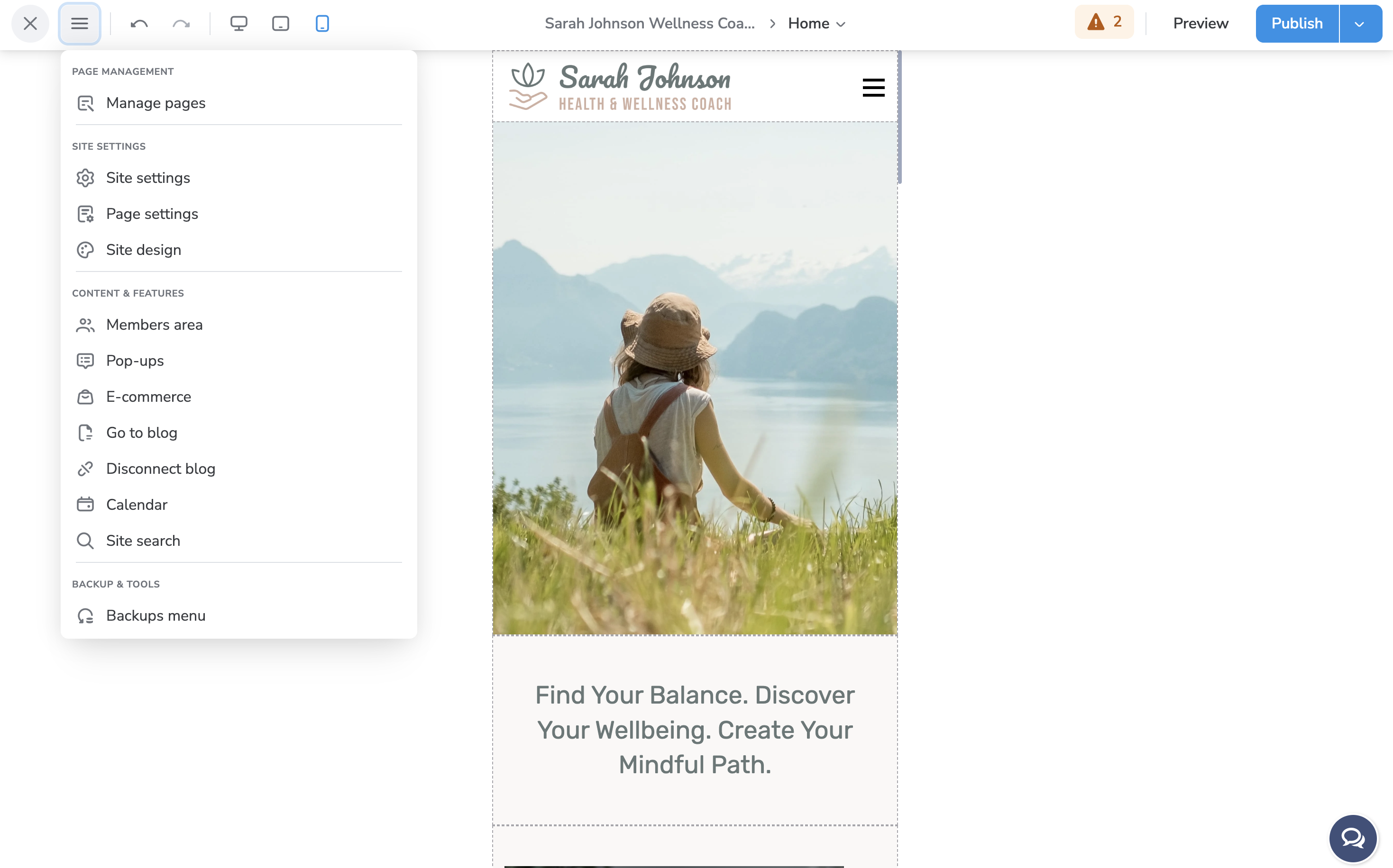
You don't need to hire a developer to build a mobile-first site. The TruVISIBILITY Sites app makes it incredibly simple.
Our drag-and-drop builder is designed to be mobile-friendly from the ground up. You can build your site visually, dragging elements exactly where you want them. Then, you can simply click the "Mobile View" toggle.
With one click, you switch to a mobile-specific editor. This function makes it easy to tweak your design specifically for phone screens - adjusting font sizes, hiding large images, and rearranging buttons to be in the "thumb zone" - without affecting your desktop layout. It's the simplest way to ensure every visitor gets a perfect experience, no matter what device they're holding.
Conclusion
It is comfortable to design for the desktop. It’s big, it’s pretty, and it feels like a digital brochure. But it is misleading. Your customers are not sitting at desks; they are moving through the world, phone in hand, looking for answers.
If you are satisfied with a "responsive" site that is just a shrunken version of your desktop vision, you are ignoring the reality of 2026. You are ignoring how people actually use the internet.
Don't let your business get stuck in the slow lane. Embrace the mobile reality. With TruVISIBILITY, you don't have to be a code expert to build a site that dominates the mobile web. You just need the right tool.
Ready to build a site that works where your customers actually are? Register for a freemium TruVISIBILITY account today and start building for the mobile-first world.
Related articles


Want to receive more articles?
Sign-up for our weekly newsletter to receive info that will help your business grow