Chat’s chatbot platform diagram view is a way to visualize the chatbot structure while giving you all the tools, components and functionality to build creative and powerful chatbots. The Diagram View represents all the chatbot scripts and script components visually consisting of nodes and connection arrows.
Chatbot Diagram Vs. Script Diagram
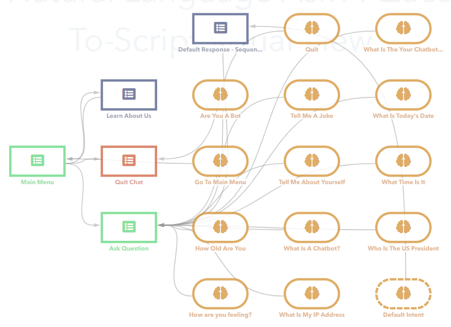
Diagram view can serve two purposes: to represent a chatbot as a set of scripts (see the picture above) or to display each chatbot script as a set of script components (this one is in the picture below).

When you select a chatbot from the list, the chatbot diagram opens. It allows you to see all the scripts for the selected chatbot and navigate through them. The connection arrows indicate the flow and script relationships. Changes to the flow must be made inside your scripts as you cannot move or delete links on the chatbot diagram.
To create a script, click on the ‘+Add Script’ button in the upper toolbar. Double click on any chatbot script will open the script diagram, which allows you to see all the components for the selected script and add to or edit them directly (move, delete, set triggers, etc).
Diagram view is enabled by default, which is indicated with the Switch to “Visual Flow Builder” icon highlighted in the upper toolbar. To switch to list view, click on the Switch to List Mode icon to the left of it.
Working With The Diagram View
As it was already said, the diagram view consists of nodes connected by links. Let’s see how you can manage them using your mouse and keyboard.
All in all, you can use the mouse cursor to hover over elements, the mouse wheel to zoom in/out, and the left mouse button to click and drag-and-drop them.
Hovering over a node (or script or component) on a chatbot diagram allows you to see the controls to edit, copy or delete the script. Hovering over a script component on a script diagram only shows the ‘X’ button to delete it.
Clicking on a node makes it selected and the above said controls become permanently visible until you unselect the node.

Additionally, clicking on the script component opens an editor which is specific for each component.
Double Clicking on a node or clicking on the edit icon allows you to drill down into that node's contents. If it is a script you will see all the components that make up that script. If it is a component of a script that you click on, it will open up the editing dialog box for you to add to or modify the contents.

If you click on a link, it becomes selected, and linking points become visible.

Clicking on the canvas unselects all selected items.
Mouse wheel allows you to zoom in and out based on the current cursor position, with one wheel step equal to 10%.
Drag-and-drop a node to move it throughout the canvas, and drag-and-drop the canvas to move the entire diagram. Note: drag-and-drop option doesn’t select or unselect the node.
If you hold the Shift key while drag-and-dropping a node, it will stick to the cells of an invisible grid (20x20 pixels) and thus will be aligned with the other ones properly.
The script diagram allows you to drag-and-drop the links using linking points. There can be three options: drag-and-drop from empty linking points, start and end linking points
When you hover over a new-created node, all its linking points become visible. They are empty yet. If you drag-n-drop it to the canvas, a template node appears and offers you to select a component from the drop-down list.
A link can be also moved by its end linking point. You can either connect it to an existing node or drop it to the canvas to create a new one with the same UI as is displayed above.
You can also delete a link by clicking on it and then using the Delete key on the keyboard.
Finally, you can move a link by its start linking point. You cannot drop a start linking point to the canvas, but you can drop it to an existing node. If there is a linking point in that node, the link will find it and connect to it. If there are several linking points, the system will offer you to select one from the drop-down list.

Both chatbot and script diagram can be managed using the keyboard. The Arrow keys will help you move a selected node with the step equal to five pixels (holding the Shift key makes the step equal to one pixel). The Delete key will delete a selected node or link.

Now, if you want to continue with the keyboard instead of the mouse, press the Esc key to cancel, or the Enter key to confirm.
Note for mobile device users: touch support is implemented for tablets and mobile phones; it works according to the mouse features, however multitouch (zooming in/out) is not supported yet.
Right Side Toolbar
Diagram view panel has five buttons (plus one additional button for the chatbot diagram) to adjust the view.
Auto Arrange button helps you put nodes and links in order and optimize their layout on the screen. It tries to arrange the diagram as a workflow, from left to right, grouping the nodes of the same level in columns. Nodes with no connections are placed at the end of the chart.

Zoom In button scales the view up

Zoom Out button scales the view down.

Actual Size button resets the view to default size.

Fit To Page button stretches or shrinks the layout depending on the page size and places it at the center of the screen.

Show Intents button (Chatbot diagram only) makes all intents that contain transfer to scripts visible and connected to the corresponding scripts. It also shows a Default Intent template node, regardless of whether the script has any intents or not. The Default Intent node has a dashed border and is not connected to any script.

Adding Script Components
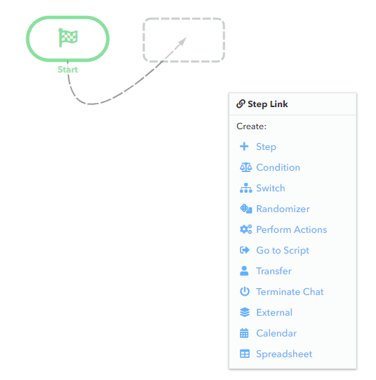
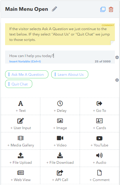
Let’s now take a closer look at the script diagram and learn how to create scripts for your chatbot. In the upper left corner of the script diagram canvas there is an ‘Add’ button. Hover it to select different components from the drop-down list and add them to your script.
If you need to add multiple components at once, it might be handy to pin the drop-down by clicking on the ‘Add’ button. Pin icon will appear in the right part of the button and the list of components will remain on the screen until you unpin it by clicking on the button again.
First of all, there is the Start component added to your script by default the moment you create it. That’s why it is not there in the drop-down list of script components. If this script should be the “opening” of the chatbot, you will need to set the triggers. On all other scripts it just indicates where this script begins, and triggers are not needed.

Step is a basic script component which allows you to input text, add media, get responses from your customers, etc.

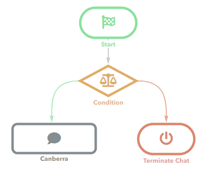
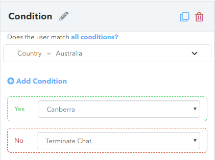
Condition component allows you to perform certain actions depending on the predetermined condition(s). The system checks if one or all of these conditions are met and redirects the flow to one script component if the answer is ‘Yes’, or to another one if the answer is ‘No’. For instance, if the ‘Country’ field’s value is equal to ‘Australia’, you go to the step ‘Canberra’, if not, you terminate the chat (see the two pictures below).
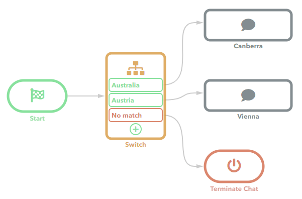
In the previous case, you could check only one condition, whether it’s true or false. If you need to check multiple values, use the Switch component, which can be simply defined as an extended Condition. You can enter as many values as you want and assign each one to a separate component.
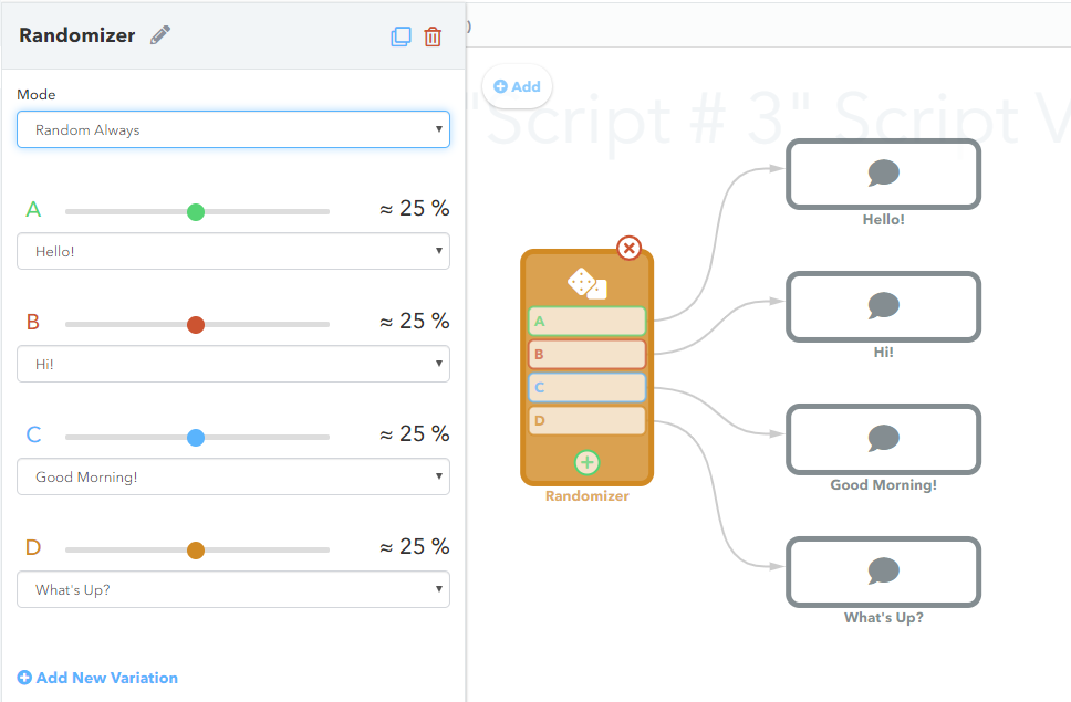
Sometimes you might want to select one of multiple options regardless of any conditions. For example, your chatbot can start the conversation in three different ways just for the sake of variety, and you need to select any of them by random.
To do so, use the Randomizer component. It will display a predefined variable with a certain probability. Probabilities for each variable can be customized, and are equal by default.
Perform Actions component helps your chatbot to perform certain actions, like creating a ticket or sending an email, and then proceed to the next script component.

Go To Script component allows you to direct the flow to a certain script. You can select the current script or any internal script in the current chatbot.

To transfer the chat to another chatbot or to a live agent, use the Transfer component. Here you can set a message being shown to the customer before the transfer, and the transfer timeout.

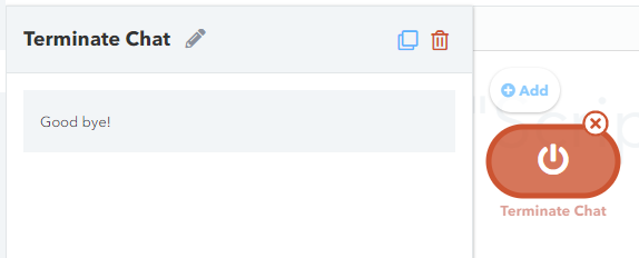
In order to stop the conversation, you use the Terminate Chat component. It has an option to enter a goodbye message if necessary.
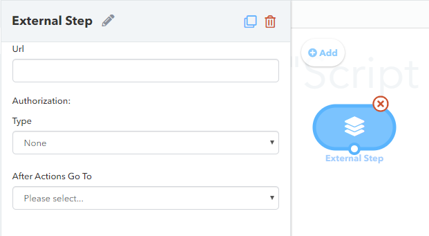
External component allows to inject and execute dynamically created steps.
If you want your customers to be informed about your working hours or to be able to book an appointment, your chatbot can connect to a Google Calendar or to a Microsoft Calendar using the Calendar component.

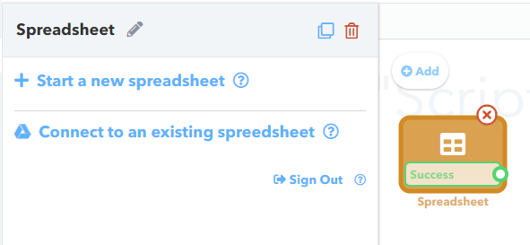
Spreadsheet component allows your chatbot to connect to an existing Google spreadsheet or to create a new one and modify it.
Other Controls
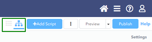
Upper toolbar
Page history is available in the Script Diagram view via Undo and Redo buttons and has a stack of 20 lines, so you can revert changes or discard them. You can also use Ctrl+Z or Ctrl+Y for the same purpose.
Three dot menu allows you to export/import your chatbot in a .json file. You can also export/import intents and unanswered questions, contained in the chatbot, in a .xlsx file. These options help you backup your chatbot and use its components for other chatbots instead of creating them from scratch. Also, you can print your diagram using the ‘Print’ option. This option works for both Chatbot and Script diagram and uses a Chat embedded print UI.
To have an idea of how your chatbot will look on the website or another channel, use the Preview option. The validation runs first, and if it goes wrong, the errors will be shown in the modal window. Clicking on any particular error will open the exact component where it occurred.
To save all changes to your chatbot and make it accessible on the website or another channel, use the Publish option. Just like the previous one, this option has a validation mechanism, which does’t allow you to publish your chatbot if it contains errors.
Help button opens the help system.
Breadcrumbs
Breadcrumbs help you to navigate through your chatbots and scripts by clicking on their name directly in the breadcrumbs or in the drop-down list which appears when you click on the downwards pointing arrow next to their names. You can also edit their names by clicking on the pencil icon.
Left navigation bar
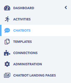
Left navigation bar helps you to navigate through the entire Chat system and can be collapsed to open up the visual view. The Dashboard page has some statistical data. The Activities section contains all the chats, tickets and callbacks for your chatbots and live agents. All the chatbots you have are listed in the Chatbots section.
The Templates page contains chatbot templates for different purposes. The Connections section has all the channels your chatbots may be assigned to. The Administration panel allows you to configure your leads, agents, banned users, etc. The Chatbot Landing Pages section contains ready-to-go webpages with chatbots to engage more customers, capture more leads, and thus take your business to the next level.

Related articles


Want to receive more articles?
Sign-up for our weekly newsletter to receive info that will help your business grow