Perhaps you’re thinking of creating and deploying a landing page for your website. You can lead people to a landing page from social channels, emails, and even using chatbots.
But how do you ensure your landing pages are actually interesting enough to have potential leads and customers enter their personal information? This information is vital for your marketing efforts. Let’s take a look at the top ways you can build the most effective landing page yet.
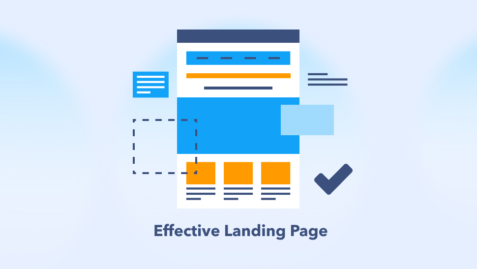
Table of Contents
- Benefits of Building Your Landing Page
- Steps to Creating a Better, More Efficient Landing Page
- Why TruVISIBILITY's Messaging is for Businesses
- Mistakes to Avoid when Building a Landing Page
- Conclusion
Benefits of Building Your Landing Page
A landing page is any webpage on which an Internet visitor first arrives on their way to an important action that you want them to take, whether it’s to sign up with their name and email to receive newsletters, get downloadable content, etc.
So what are the benefits of building a landing page yourself? Let's go over a few things to consider.
Manage and Bring in Leads
If you’re thinking of making a landing page, you likely already know your goal is to bring in leads. Sometimes, this isn’t always the goal - at least not the direct goal.
Landing pages can offer valuable content, such as downloadables. Either way, however, you have that contact’s information now to send future marketing campaigns. Landing pages can even help manage or organize your leads, especially if your pages are connected to your email application directly.
Your leads can answer questions that automatically put them into groups, such as “Older than 40” or “Younger than 25”, which may come in handy when it comes time to send an email marketing campaign to just your young adult leads. This all depends on how you set up your form on your landing page, which you can fully customize.
Total Control of Design and Message
Isn’t it nice to know you can have total control of your color and layout? Having a marketing agency do it for you may end up disappointing you. This results in a lot of back and forth until you are happy with what the developers did.
Aside from also being less expensive, designing a landing page yourself can be more liberating since you can change your message, colors, images, etc. at any time.
Ability to Connect to Other Apps
When you have control of your landing page, guess what else you have control over? The apps connected to your pages.
A good landing page builder should seamlessly connect to your email app, chatbot app, and all your other web pages on your site.
TruVISIBILITY focuses on integration with your social channels as well. Learn how you can make this process easier by having an ALL-IN-ONE DIGITAL MARKETING SUITE. Having all of your marketing needs met in one software is much easier than having a separate account for email and separate software for website building.
Steps to Creating a Better, More Efficient Landing Page
Alright, now let’s cover the most important topic of this article. How can you ensure your landing page is efficient?
What does efficient even mean? It means your return on investment (ROI) is comparable to what you paid for the landing page builder. If you get $100 a month from people interacting with your page but you only pay $1 for that service, then your profit of $99 a month isn’t bad!
Even if you don’t see a ton of sales right away, you can be gaining a lot of leads and contact information. This can be invaluable in the long run as you send more and more marketing material and valuable content to those contacts.
Let’s dive deeper into each step you should take into account when creating a great landing page.
Keep It Visually Simple
Keeping your layout visually stunning (and not overwhelming) will turn on or off certain audience groups. What are some other things to keep in mind visually?
- Visual simplicity maintains whitespace that focuses visitors on calls to action (CTAs) by isolating them from other elements.
- Visual simplicity makes it easy for the key features and calls to action to stand out.
- Visual simplicity creates contrast by displaying elements in a way that make them stand out.
Visual simplicity maintains the design flow by placing elements in a way that directs the user to keep reading.
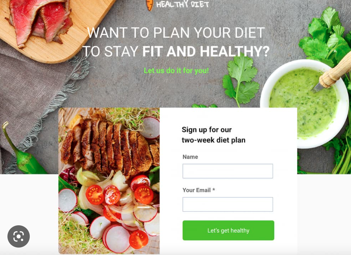
Consider Great Images and Videos
Using pictures of real, everyday people instead of objects or stock images helps to create a more personal connection and elicit more empathy from visitors.
Because people typically make their decisions emotionally and subconsciously, creating an emotional connection through images is a very powerful technique.
Learn How to Use Color
Color must match your brand. Period. Color psychology may be something you want to look into while designing your landing page as well. Here are some things to keep in mind when choosing colors for your page:
- Understand how to use high and low colors that allow the creation of high contrast, which is directly tied to copy readability.
- Create a color palette comprised of compatible color combinations and built on complementary/opposite colors.
- Address colors from the perspective of your audience. Are they attracted to bright colors? Or are you targeting a manly product that calls for more dark, blue, or even matte colors? Depending on the product/service, use colors that convey the right message.
- Consider color symbolism when targeting different demographics. Various cultures interpret colors differently, so what works for one user base might not work for another.
- Understand that color interpretation varies from gender to gender, and there is • no “bullet-proof” solution when it comes to picking one.
Remember that it isn’t just the color combination you choose but how you use it as well. Your main logo may be bright yellow, but a lot of yellow on the page can be blinding. Keep these things in mind and you’ll have a readable and pleasant-looking landing page.
Make a Responsive Design
Online purchases made from mobile devices are growing, thus mobile phones will soon become a major source of traffic for shopping and purchases made online. Because landing pages are conversion-oriented, it’s important to understand the potential of the mobile audience and adapt towards that traffic funnel.
Make Concise Headlines
Headlines should be catchy enough to read the rest of your message on your landing page. Based on how enticing the headline is, your visitor will either click on the landing page or not. The next hurdle is delivering on your promise from your headline, if there is such a promised value proposed.
So what makes up a great headline? An effective landing page headline is:
- Persuasive and catchy
- Brief but clear, and states what problem it solves
- Conveys a sense of urgency
Such examples of this could be: “Sign Up for Your Free Guide on Proper Diabetes Care” or “72 Hours Left to Claim Your $10 off Anything”.
Create Enticing CTAs
Now you’ve got the headline down, which advertises what the visitor will get if they proceed to interact with your landing page. The next step is actually getting them to click on the button. This is the real next challenge since it also has to be catchy, clear, concise, and state what they will get by clicking the button. Much like a headline.
Call-to-action (CTA) buttons are, for the most part, a great way to get people to click on to be redirected to your landing page. The other CTA button they will likely encounter on your landing page is either “Submit” (if they are filling out a form that is directly on your page) or another unique button that can take them to a downloadable source, free coupon code, etc.
Enticing CTAs need to:
- Match the message of your headline
- Erase any confusion about what they are clicking the button for
- Have short copy with keywords that make visitors want to click on it
- Have words with a clear action the visitor should take, such as “Get”, “Click here for”, or “Download”.
You can even look at your competitor’s CTA buttons to see what looks “spammy” and which are actually enticing. Ask yourself why it works or doesn’t work and try to emulate that methodology into your own CTAs.
Why TruVISIBILITY's Messaging is for Businesses
Sometimes, using a landing page template and connecting it to your current website is a great way to ensure the landing page layout is already optimized for high conversion rates.
TruVISIBILITY has numerous templates designed just for lead conversion. Plus, they can be added to your website in no time. All of the TruVISIBILITY’s templates are free as well.
And don’t worry, you can customize them however you like to match your brand and message. Add images, video, a different form and sections for leads to fill out, along with countless other widgets.
You can start building your own landing page from a blank template or use a pre-created layout today.
Mistakes to Avoid When Building a Landing Page
You’ve surely seen downright bad landing pages. These are the ones where you don’t know where to click because you’re overwhelmed with content in a not-so-linnear design or layout.
We’ve put together the top mistakes we see new and growing businesses make when building landing pages. Luckily, TruVISIBILITY already makes it simple to build a mistake-free page with widgets adjusted to make your landing page look as attractive as possible and not cluttered.
Low Graphics or No Imagery
This mistake can be two-fold. We always suggest ensuring your landing page is optimized for mobile use. A huge (very noticeable) hiccup if it is not optimized for mobile is its display of images.
Low graphic images will come off as grainy and unrecognizable. This not only will hurt whatever message you are trying to convey, but it can confuse and turn off visitors from your landing page.
If you have a picture of nails being painted for your salon but it is blurry, it could appear as someone getting a flu shot. This could make the visitors think they clicked on the wrong page, such as a medical page instead.
Having no imagery is just as bad. If your page has colors or logos of your brand, that is totally acceptable. We are not talking about those. Images, particularly those of real people, have more impact on selling someone to take that action the landing page is asking of them.
Quick note, however: DO NOT go overboard with imagery since this makes your landing page too long to keep the attention of your visitors.
Complicated Page Layouts and Too Much Content
Landing pages are meant to be easy to use and quick to understand. Layouts that are too complex to scroll, hard to scan, and overloaded with UI elements rarely provide value and dramatically reduce landing page conversions.
Adding menu items, navigation bar, a footer, etc. should be considered after building a simpler version of your landing page. There should only be a select few cases where the need for the extra web page widgets become necessary.
Text Copy that Isn’t Scannable
We’ve said it before in past articles, and we’ll say it again. Don’t write TOO much. Landing pages should have thorough and valuable content, but visitors of this page don’t want to read a novel.
How can you make sure your text blocks aren’t too intimidating?
- Use enough white space
- Break up more paragraphs
- Imbed images or GIFs into your copy
- Shorten sentences that can be shortened
By doing all of these things, you can quickly get your point across to your audience. And when they are happy, they are more likely to complete the action the landing page is asking of them.
Conclusion
You have learned how to get the most out of the landing pages you build, and hopefully, a little more. With these visual examples and inspiration, you can easily start building the most effective landing page to catch your audience’s attention.
Want the no. 1 design in landing page forms? TruVISIBILITY’s landing page and website builder is becoming one of the most coveted builders because of its ease of use and effectiveness in building a company’s ROI. Build a page today, free as always!
Related articles


Want to receive more articles?
Sign-up for our weekly newsletter to receive info that will help your business grow